Inspo
Redesigning a search engine to ideate, brainstorm and gather inspiration.
Redesigning a search engine to ideate, brainstorm and gather inspiration.
Product Design
·
Web
·
2020 - 2021

OVERVIEW
Unlike tools and platforms that focus on later stages of the creative process, such as execution and distribution, there have been no effective tools that help creatives at initial stages like gathering inspiration, ideation and brainstorming.
To fill this need, Dhru and Andy came up with the idea of building Inspo.
I joined Inspo as a Product Designer to help redesign the Inspo web app improving the overall user experience for the public launch. At the time, it was still in private beta and was being used by creatives at global brands and agencies like Ogilvy, Dentsu, Tinder, Jio, Royal Enfield, and a few hundred freelancers.
Our efforts resulted in a simplified user experience, increased retention and a successful public launch.
TIMELINE
Dec 2020 - Oct 2021
ROLE
Product Design
CONTEXT
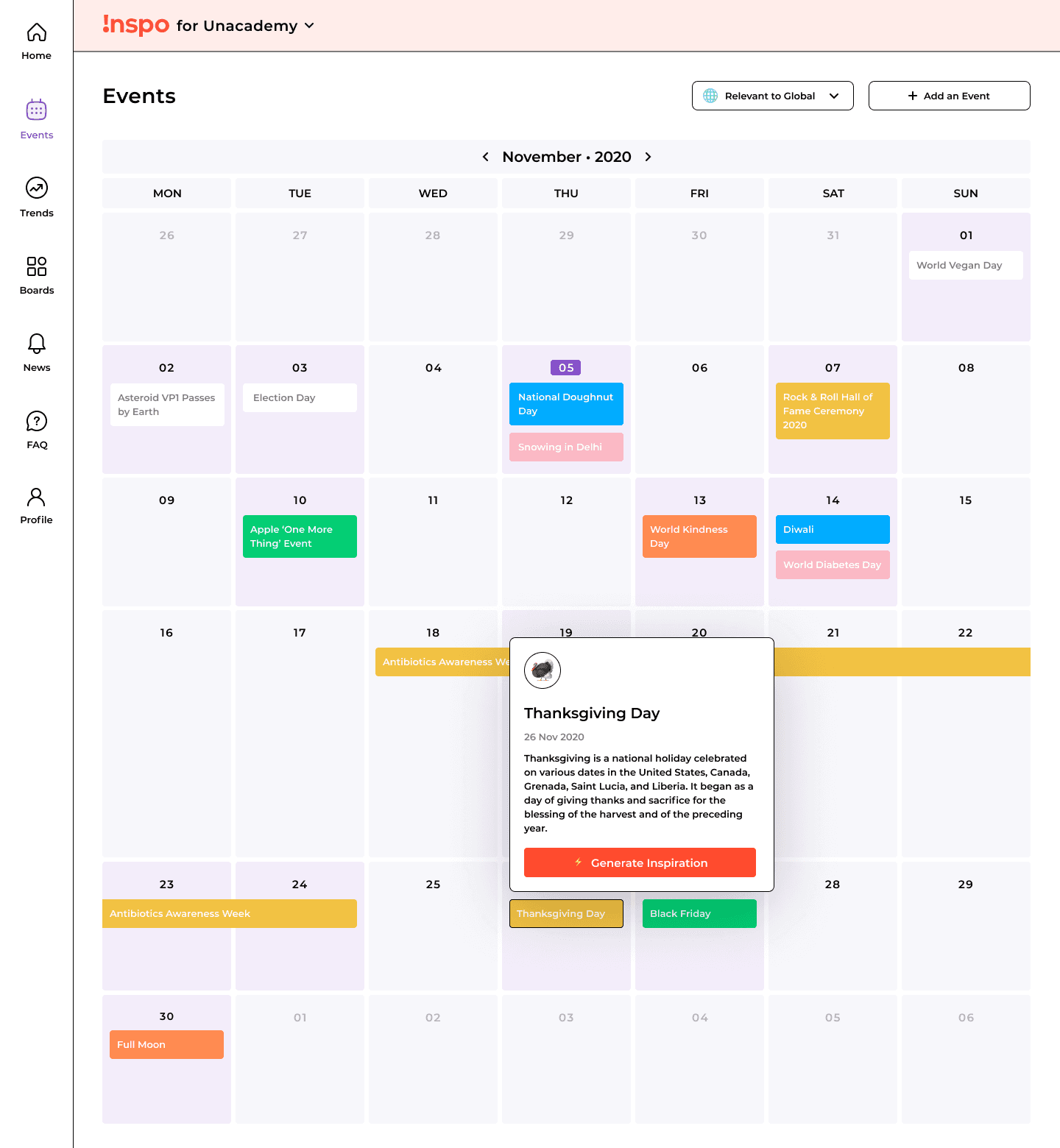
In this early version of Inspo, when users search for a keyword like "coffee" or click on an event on the Inspiration Calendar (e.g. Thanksgiving Day), it quickly generates relevant thought starters using GPT-3.
Users can save their favourite inspirations to Inspiration Boards and even convert them into visual designs using Canva, a graphic design platform.

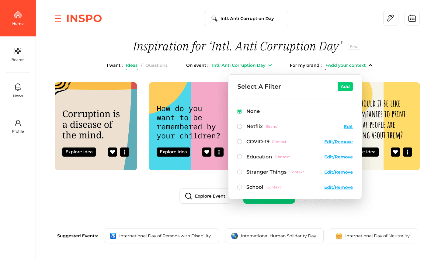
Using Brand Filter, the thought starters and inspirations can be tailored to a specific brand or topic, such as generating coffee-related ideas for 'Netflix'.
Using Brand Filter, the thought starters and inspirations can be tailored to a specific brand or topic, such as generating coffee-related ideas for 'Netflix'.
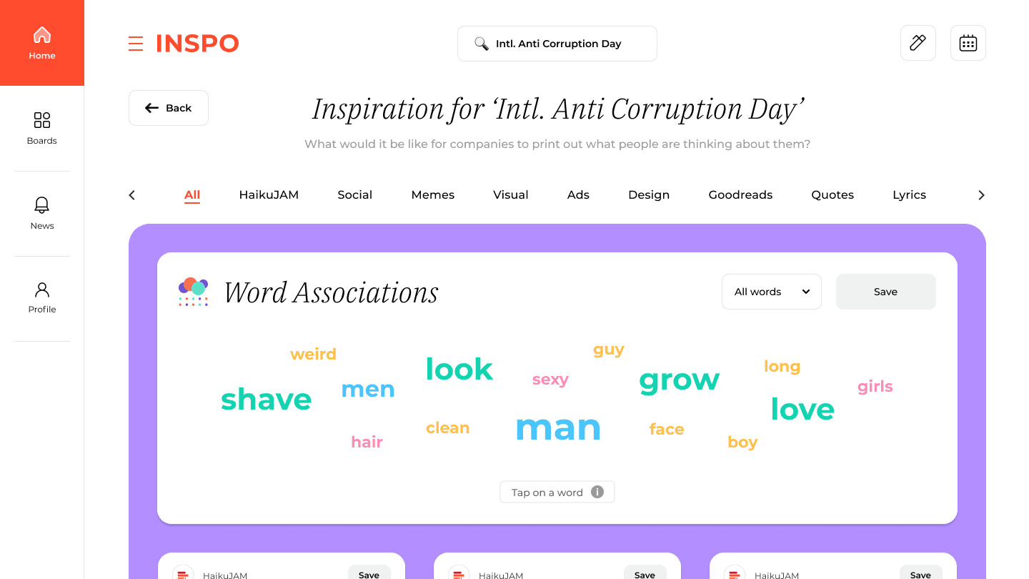
Additionally, the discovery feed helps users find creative associations from HaikuJAM and inspirations from web sources like Reddit, Twitter, Goodreads, 9GAG, Creative Bloq, Unsplash, and more.
Additionally, the discovery feed helps users find creative associations from HaikuJAM and inspirations from web sources like Reddit, Twitter, Goodreads, 9GAG, Creative Bloq, Unsplash, and more.
CHALLENGES
We found the following challenges after doing multiple user interviews:
AI thought starters were given more prominence in the search experience because of which users were not able to creatively associate them together with inspirations from other web sources.
Staying on top of new and upcoming trends was more important to a lot of users than events.
Lots of UI components and their specific states were inconsistent which created friction in the design handoffs.
We found the following challenges after doing multiple interviews of early users:
AI thought starters were given more prominence in the search experience because of which users were not able to creatively associate them together with inspirations from other web sources.
Staying on top of new and upcoming trends was more important to a lot of users than events.
Lots of UI components were inconsistent which created friction in the design handoffs.
We found the following challenges after doing multiple user interviews:
AI thought starters were given more prominence in the search experience because of which users were not able to creatively associate them together with inspirations from other web sources.
Staying on top of new and upcoming trends was more important to a lot of users than events.
Lots of UI components and their specific states were inconsistent which created friction in the design handoffs.
APPROACH
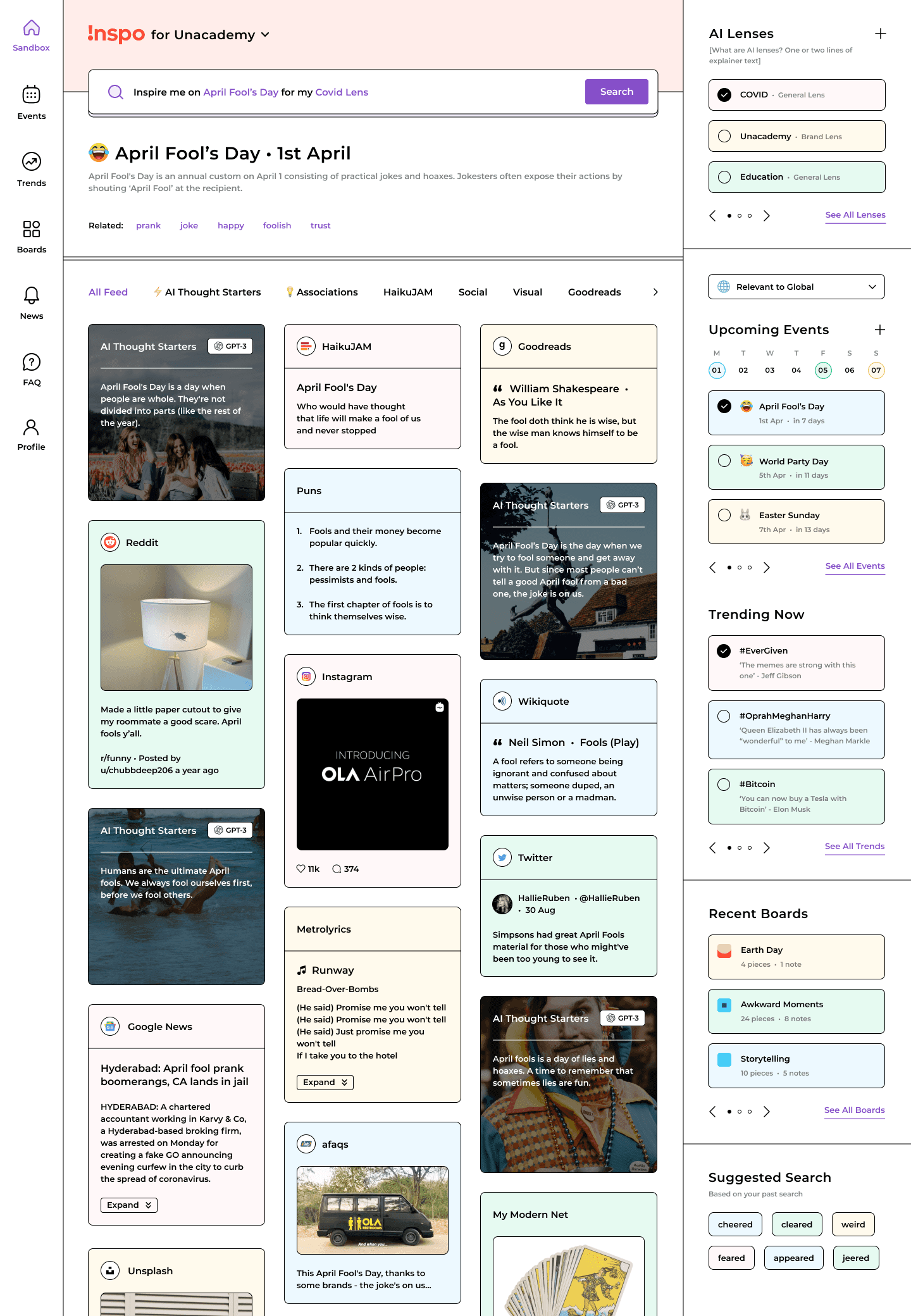
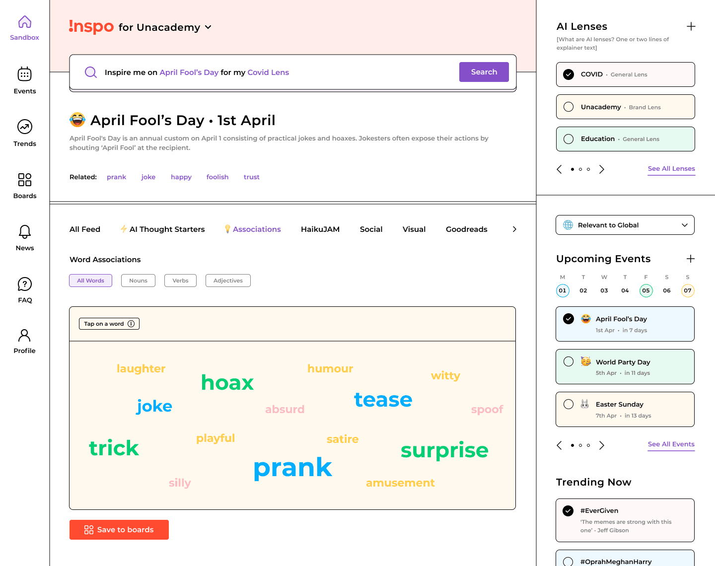
We made it easier to make creative associations by merging AI thought starters and inspirations from different sources into the same discovery feed.
Due to frequent use-cases of AI lens, Events, Trends and Boards for contextualising inspirations, we took inspiration from widgets to make accessibility easier through the column on the right side.
We made it easier to make creative associations by merging AI thought starters and inspirations from different sources into the same discovery feed.
Due to frequent use-cases of AI lens, Events, Trends and Boards for contextualising inspirations, we took inspiration from widgets to make accessibility easier through the right hand column.
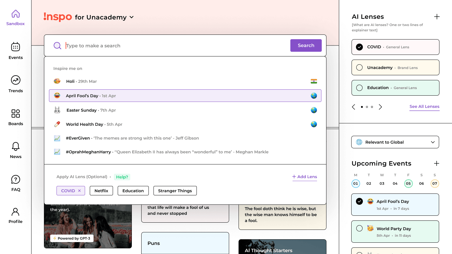
Better search experience with suggested upcoming events and new trends along with an easy way to apply or modify AI lens.
Better search experience with suggested upcoming events and new trends along with an easy way to apply or modify AI lens.
AI thought starter cards with consistent font style for better legibility and background images to differentiate it from inspirations from other sources.
AI thought starter cards with consistent font style for better legibility and background images to differentiate it from inspirations from other sources.
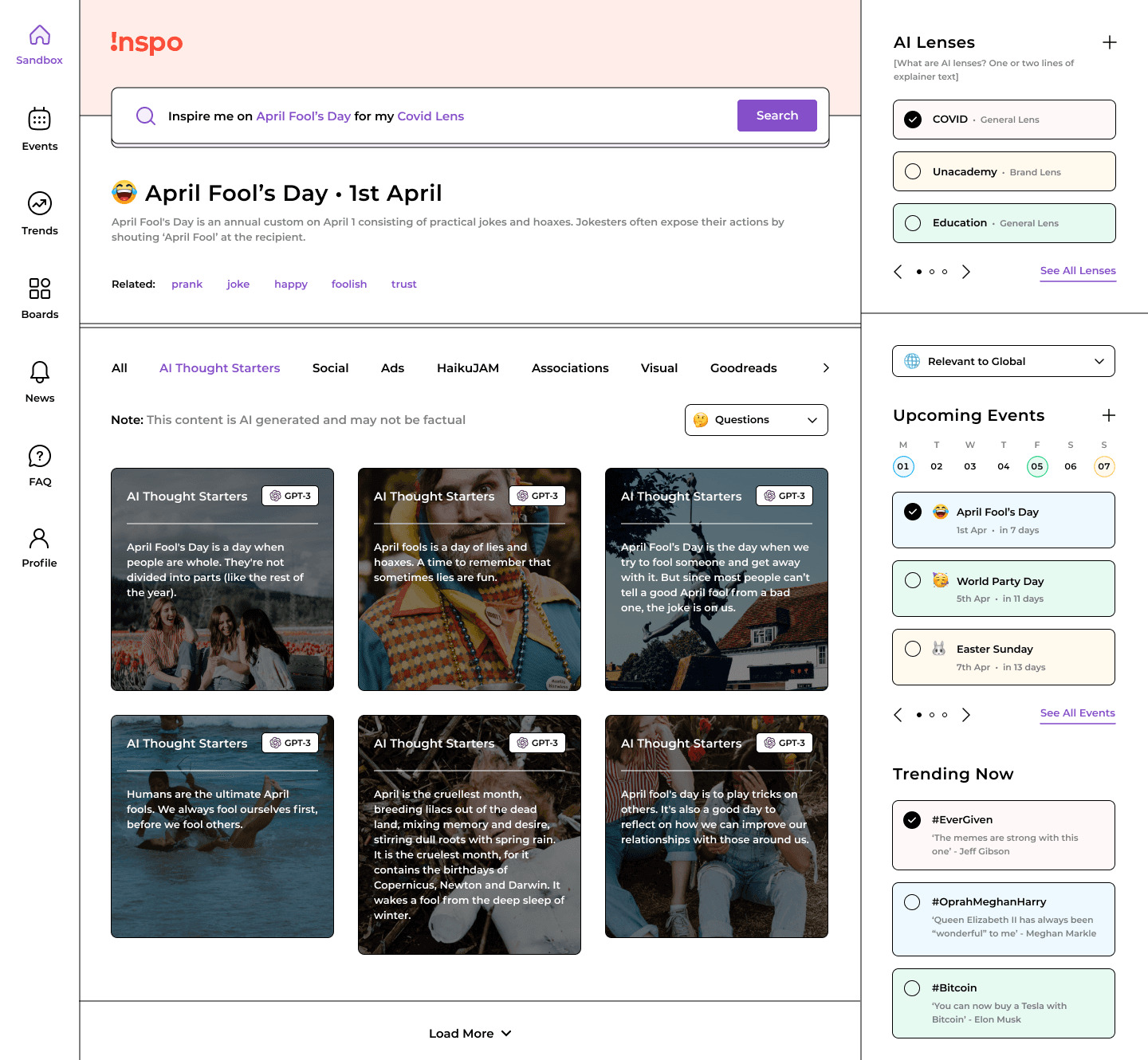
Similarly, we made UI components and their states consistent across other sections as well.
Similarly, we made UI components and their states consistent across other sections as well.

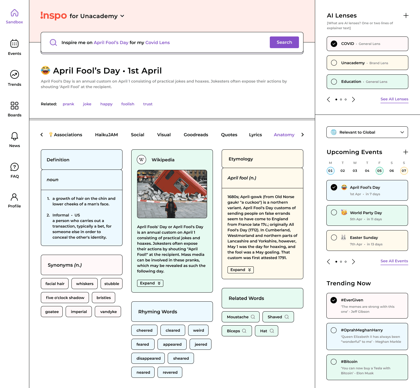
Detailed views for Events, Trends and Boards were shifted to the navigation bar on the left side.
Detailed views for Events, Trends and Boards were shifted to the navigation bar on the left side.


TAKEAWAYS
The redesign exercise led to a much better user experience and retention.
We discovered that users preferred ready-to-use AI-generated templates for their specific content use cases instead of thought starters.
We also discovered the importance of having a community-curated model for Inspo.
Learned a lot about creating and maintaining clean design documentation from scratch.
© 2023 Prakhar Shivam · Currently based in India
Built with Framer · Typeset in Satoshi & Newsreader
© 2023 Prakhar Shivam · Currently based in India
Built with Framer · Typeset in Satoshi & Newsreader
© 2023 Prakhar Shivam · Currently based in India
Built with Framer · Typeset in Satoshi & Newsreader